
Calligraphy, hand lettering, brush lettering, typography, faux calligraphy, hand type, modern calligraphy... if you’ve been around instagram recently there’s a good chance you’ve come across one or all of these and probably wondered... what do they all mean?
I’ll be honest, it’s not always easy to define the difference, but, in my opinion at least it comes down to two things, intent and process.
What separates all forms of lettering from handwriting is intent. Handwriting is simply a method of communication, whether it be what you need from the supermarket or getting thoughts out of your head and onto the page. That’s not to say there isn’t beautiful handwriting out there, but generally it requires no special tools or process.
Then we get to lettering - lettering is just an umbrella term that covers any form of letter or word based art. Underneath lettering you can broadly break it down into three categories: hand lettering, calligraphy and typography. All three, but especially typography, are huge subjects in their own right so this is really just an overview - there are some great resources out there if you decide to dig in deeper!
Typography
I’ll start here because it’s the easiest to separate and also not the focus of this post, more of an honorable mention.
Typography is the design and arranging of letters in a (usually) legible and appealing way. It encompasses designing and selecting fonts and the structure and hierarchy of text. It refers to both digital and print and has it origins in the printing presses of days gone by. It has a huge influence on how we interact with any given item and the world at large - be honest, how many times have you not shopped somewhere or bought something because the font was awful?
Side note for the curious: A typeface is a family of fonts - for example, Helvetica is a typeface, but Helvetica Regular or Helvetica Light are fonts. So fonts are just the variants within a type family.
Calligraphy
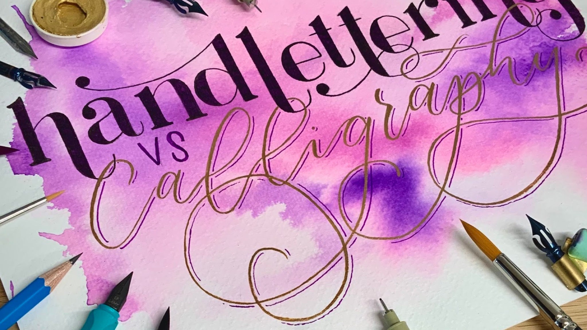
Calligraphy is essentially the art of beautiful writing. There are usually “specialist” tools involved - dip pens, brushes or brush pens, parallel pens and ink - but the words are still written, using a series of basic strokes and flourishes.
The basic strokes themselves generally focus on a heavier, thicker downstroke, and a light, thin upstroke, achieved through varying the pressure or angle of the writing instrument. It requires a certain degree of practice to build up muscle memory and fluidity, but consistency is key here. Ten minutes a day is much better than ten hours in one go only once a month.
There are so many different forms of calligraphy, each with its own set of techniques and rules and tools and as much as I wish I was an expert in all of them, my little corner of knowledge focuses on western calligraphy primarily of the modern variety. But there are some absolutely stunning examples of non-western/latin based calligraphy around that I strongly recommend having a look for!!

The key difference between Traditional western calligraphy and Modern calligraphy? Rules. Traditional calligraphy has a long (long!) history. Thanks to computers, calligraphy is now largely a form of creative expression; yes, we use it on invitations and signs and the like to convey information, but at one point it was the only way to disseminate information or create records. So as scripts developed, so too did the rules to guarantee consistency and legibility. Learning traditional calligraphy styles such as copperplate or spencerian script is interesting and really helpful for understanding the basic principles and I definitely recommend it. But personally I stuck with it for as long as it took me to feel competent and then started developing my own, more modern (and less rule based!)

Modern Calligraphy mostly uses a simple dip pen and ink. Dip pens can be either straight (copperplate example) or oblique (modern example) - it’s easier to start off with a straight holder until you build up some confidence, oblique holders can be a little odd to begin with. There are literally hundreds of different nibs available and experimenting with them all is definitely part of the fun, but beginner favourite is hands down the Nikko G.

Then you also have brush lettering. Brush Lettering is calligraphy but specifically with either a brush pen, or an actual paintbrush. It’s a bit of a murky crossover - you can achieve a more traditional calligraphy style, through the same process (writing not drawing) with brush pens, but they’re more versatile than a dip pen allowing you to get a much wider variety of styles, more akin to hand lettering.
Hand Lettering

Very basically, hand lettering does what it says on the tin - it’s a form of lettering, by hand. The key distinction is in how it is created; whereas in calligraphy words are written, hand lettering is more illustration based - the letters or words are drawn. Pieces of hand lettering tend to stick to short quotes or single words, and often include a few contrasting styles of lettering, unlike calligraphy where longer pieces are more common and tend to stick to the one style.
As such handlettering requires no specific tools or knowledge, although an understanding of both typography and calligraphy helps hugely with composition and stylizing your letters. Every artist will have their favoured tools, but it really is as easy and simple as grabbing a piece of paper and a pencil to get started. I find that dotted paper helps enormously, making it easy to whip up a quick grid and plan the layout. Hand lettering is a popular choice for signs and unusual surfaces thanks to the almost limitless pen

Faux Calligraphy is a popular choice for achieving a calligraphy look but on a larger scale! You mimic the downstroke from a dip pen simply by thickening the line, which in some cases is virtually indistinguishable from genuine calligraphy. It’s a great way to do “calligraphy” on odd surfaces too.
Hopefully that makes things a little clearer! Understanding the differences between the different methods is important, especially when it comes to selecting the right tool for the job, but don’t get too hung up on it. The most important thing is to get stuck in and have some fun with it!
And don’t forget to share your creations using #allthingsanalogue - we love to see what you’re creating!